Final Project
|
|
This is my final project. For the final project we had to design and sketch a logo for an art gallery called "Creative Element". For this project I decided to make something simple but fun. I sketched out many ideas first but then decided that they were too boring to make. The second picture is my final product. To make it I used the pen tool, the selection and deselection tool, the color swatches, and the rounded rectangle tool.
|
Ad project
|
|
This is my ad project. For this project we picked a company to make an ad and a billboard for. I picked the company called The Coffee Bean. The first picture is of my ad sketch. The second picture is my sketch of the billboard I made for the company. They both needed to be easy to read, simple, and clean so that people would be able to see them. The tools I used the mot were the text box tool, the star, the selection tool, and the direct selection tool.
|
3 Logo Design |
This is my logo designs. For this project we had to choose 3 logos. I chose the star, lightning, and a snowflake. Auto trace, text box tool, and the pen tool are what I used to make these. I had to make the logos simple, versatile, memorable, timeless, and appropriate. I sketched out some ideas on paper first so that I had an idea of what I was going to do. I messed around and changed my designs a few times before I found what I liked.
|
Typography
|
|
This is my typography project. I had to take 3 words and make them look like what they mean. I had the words follow, doubled, and grow. For follow, I made it look like it was on a road following the yellow lines, and the letters were getting smaller. For doubled, I made the word be doubled. For grow, I made it look like the word was growing out of the ground.
|
Surrealistic
|
|
In this project, I had to make a fake picture look like it was real. I decided to make a flying dog. For this project, I used similar tools in this project as I did in the realistic project. To crop out the dog and the wings from their original pictures and place them on the cloud picture, I used the magic wand tool. Then I had to adjust the size of the dog and the size of the wings to make it look more natural.
|
Realistic
|
|
In this project, I took the original picture and cropped out the drink. Then I found a picture of a sea shell and a crab and added them to the picture the drink was on. I used many new tools to make this, such as the burn tool and the lasso tool. The burn tool I used to create a shadow under the crab and the sea shell. The lasso tool I used to crop out the drink, sea shell, and the crab. This project was really fun to do.
|
Clipping Mask
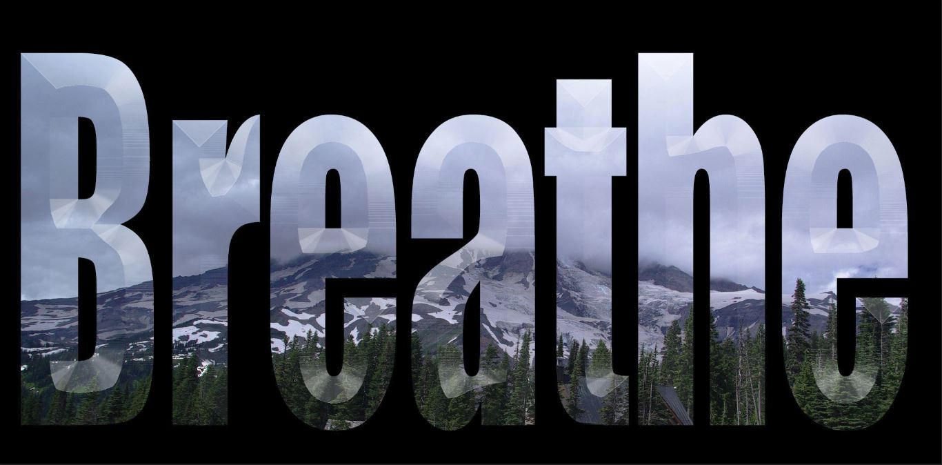
This is the clipping mask I made this week. I used a picture of mountains with trees in front of them and a foggy sky that I got off of Google. I then made the picture into the word breathe. I choose the word breathe because when I think of mountains, trees, and nature I think of air and relaxing.
Cherry
|
|
This week the project was to pick out a fruit and to trace it with the pen tool. The idea was to make it look real. We learned how to use the gradient mesh tool. The gradient mesh tool is what the second picture is on the slide show. At first it was confusing to use, but after a few lines, it got easier. I also learned how to use the eye drop tool. I used the eye drop tool to get the same shade of red as the original cherry picture.
|
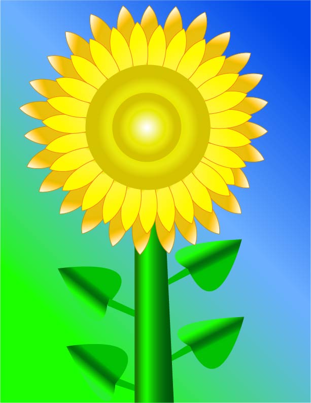
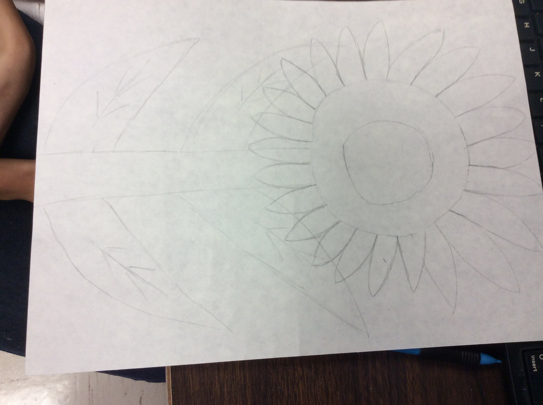
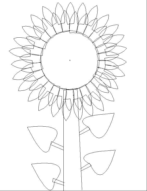
Sun Flower
|
|
|
This is the sunflower I made in my graphic design class. I decided wanted to make a sunflower. First, I sketched out my idea on paper. After that I was able to take a picture of my sketch and put it on the computer so that I could trace and edit it. The most interesting part for me was learning how to use the pen tool. I also learned how to use the gradient tool. The gradient tool was fun to use and really made things look cool. At times, it was frustrating and difficult, but once I got the hang of it, it was a lot easier.
|
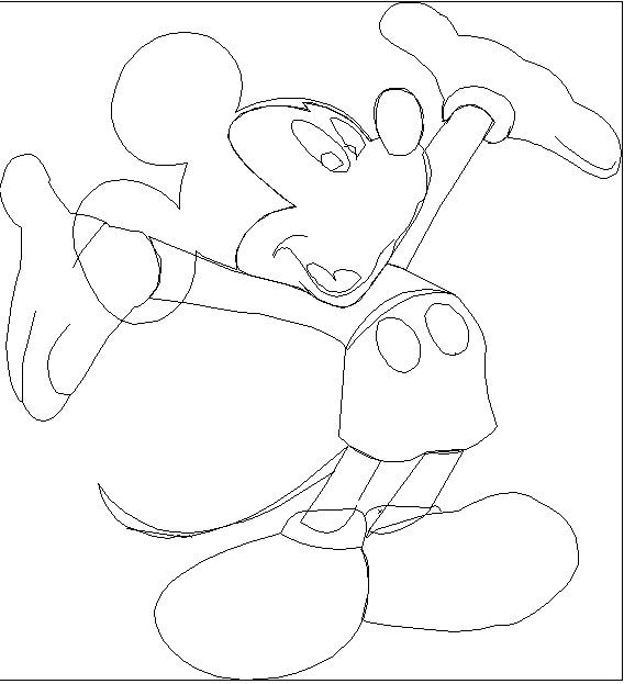
Mickey practice

This is the Mickey Mouse I made in my graphic design class. It was the first thing I made on the computer using the pen tool. At first it was really challenging to do. After a while, it got a lot easier. I had got the picture off of Google and then traced it and filled in the colors. The more I got used to the pen tool, the easier it got.
|
|
